Getting Started
Button
Cards
Icons
Loaders
Text
Others
Rotating Card Gallery16
Rotating Card Gallery
A stunning 3D rotating carousel that displays cards in a circular formation with smooth continuous rotation. Features pause-on-hover functionality, smooth scaling animations, and beautiful reflections for an immersive gallery experience.


Install Dependencies
npm i motionAdd CSS Variables
global.css
:root {
  --carousel-duration: 30s;
  --carousel-depth: 180px;
  --card-width: 80px;
  --card-height: 120px;
}

@media (width > 600px) {
  :root {
    --carousel-depth: 330px;
    --card-width: 120px;
    --card-height: 180px;
  }
}
Code
RotatingCardGallery.tsx
"use client";
import { motion, useMotionValue, useAnimationFrame, animate } from "motion/react";
import { useState, useRef } from "react";
interface Card {
title: string;
src: string;
alt: string;
}
const cards: Card[] = [
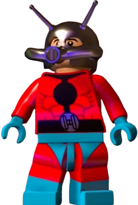
{ title: "Ant-man", src: "https://raw.githubusercontent.com/cbolson/assets/refs/heads/main/codepen/lego/ant-man.webp", alt: "ant-man" },
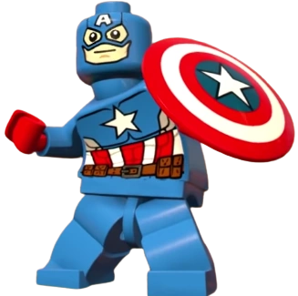
{ title: "Capitan America", src: "https://raw.githubusercontent.com/cbolson/assets/refs/heads/main/codepen/lego/capitan-america.webp", alt: "capitan-america" },
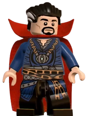
{ title: "Dr Strange", src: "https://raw.githubusercontent.com/cbolson/assets/refs/heads/main/codepen/lego/dr-strange.webp", alt: "dr-strange" },
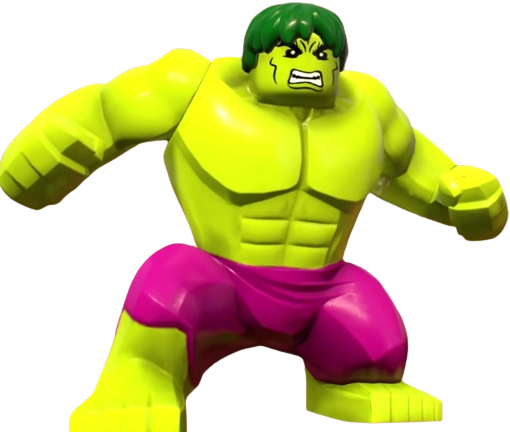
{ title: "Hulk", src: "https://raw.githubusercontent.com/cbolson/assets/refs/heads/main/codepen/lego/hulk.webp", alt: "hulk" },
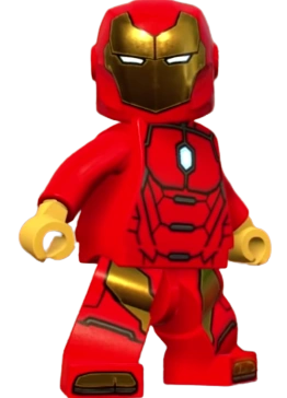
{ title: "Iron Man", src: "https://raw.githubusercontent.com/cbolson/assets/refs/heads/main/codepen/lego/iron-man.webp", alt: "iron-man" },
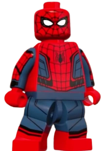
{ title: "Spiderman", src: "https://raw.githubusercontent.com/cbolson/assets/refs/heads/main/codepen/lego/spiderman.webp", alt: "spiderman" },
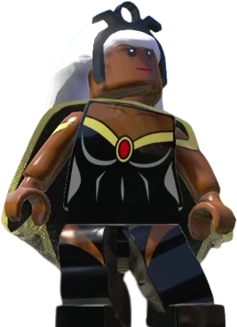
{ title: "Storm", src: "https://raw.githubusercontent.com/cbolson/assets/refs/heads/main/codepen/lego/storm.webp", alt: "storm" },
{ title: "Thor", src: "https://raw.githubusercontent.com/cbolson/assets/refs/heads/main/codepen/lego/thor.webp", alt: "thor" },
{ title: "Wolverine", src: "https://raw.githubusercontent.com/cbolson/assets/refs/heads/main/codepen/lego/wolverine.webp", alt: "wolverine" },
];
export default function Carousel() {
const [hoveredIndex, setHoveredIndex] = useState<number | null>(null);
const rotation = useMotionValue(0);
const speed = 0.15; // rotation speed
const paused = useRef(false);
// Animate rotation manually for smooth pausing
useAnimationFrame((t, delta) => {
if (!paused.current) {
rotation.set(rotation.get() + speed * (delta / 16));
}
});
const resumeRotation = () => {
paused.current = false;
// Smoothly resume rotation
animate(rotation, rotation.get(), { type: "spring", stiffness: 100, damping: 20 });
};
return (
<section
className="relative w-full h-[400px] sm:h-[600px] flex items-center justify-center overflow-hidden"
style={{ perspective: "1000px" }}
>
<motion.div
className="relative w-full h-full"
style={{
transformStyle: "preserve-3d",
position: "absolute",
inset: 0,
margin: "auto",
rotateY: rotation,
}}
>
{cards.map((card, i) => (
<div
key={i}
className="absolute top-1/2 left-1/2"
style={{
width: "var(--card-width)",
height: "var(--card-height)",
transformStyle: "preserve-3d",
transform: `translate(-50%, -50%) rotateY(${(360 / cards.length) * i}deg) translateZ(var(--carousel-depth))`,
WebkitBoxReflect:
"below 5px linear-gradient(to top, rgba(0 0 0 / .15) 25%, transparent)",
}}
onMouseEnter={() => {
paused.current = true;
setHoveredIndex(i);
}}
onMouseLeave={() => {
setHoveredIndex(null);
resumeRotation();
}}
>
<motion.img
src={card.src}
alt={card.alt}
className="w-full h-full object-cover rounded-xl shadow-lg"
animate={hoveredIndex === i ? { scale: 1.15 } : { scale: 1 }}
transition={{ type: "spring", stiffness: 200, damping: 15 }}
/>
{hoveredIndex === i && (
<motion.span
initial={{ opacity: 0, y: 10 }}
animate={{ opacity: 1, y: 0 }}
exit={{ opacity: 0, y: 10 }}
className="absolute bottom-full left-1/2 -translate-x-1/2 mb-2 text-sm text-white px-2 py-1 "
>
{card.title}
</motion.span>
)}
</div>
))}
</motion.div>
</section>
);
}Customization
You can customize the carousel by modifying the CSS variables:
:root {
  --card-width: 250px;     /* Width of each card */
  --card-height: 350px;    /* Height of each card */
  --carousel-depth: 400px; /* Distance from center */
}
Props
| Prop | Type | Default | Description |
|---|---|---|---|
cards | Card[] | Default superhero cards | Array of card objects with title, src, and alt properties |
Card Interface
interface Card {
  title: string;  // Card title shown on hover
  src: string;    // Image source URL
  alt: string;    // Alt text for accessibility
}
Rotating Card Gallery16